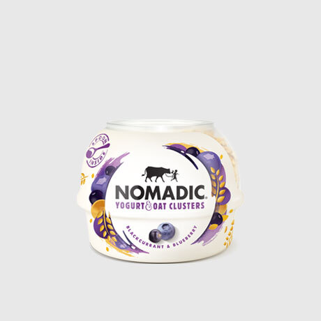
NOMADIC DAIRY
Brand Development / Packaging Design / Website Design
The Brief
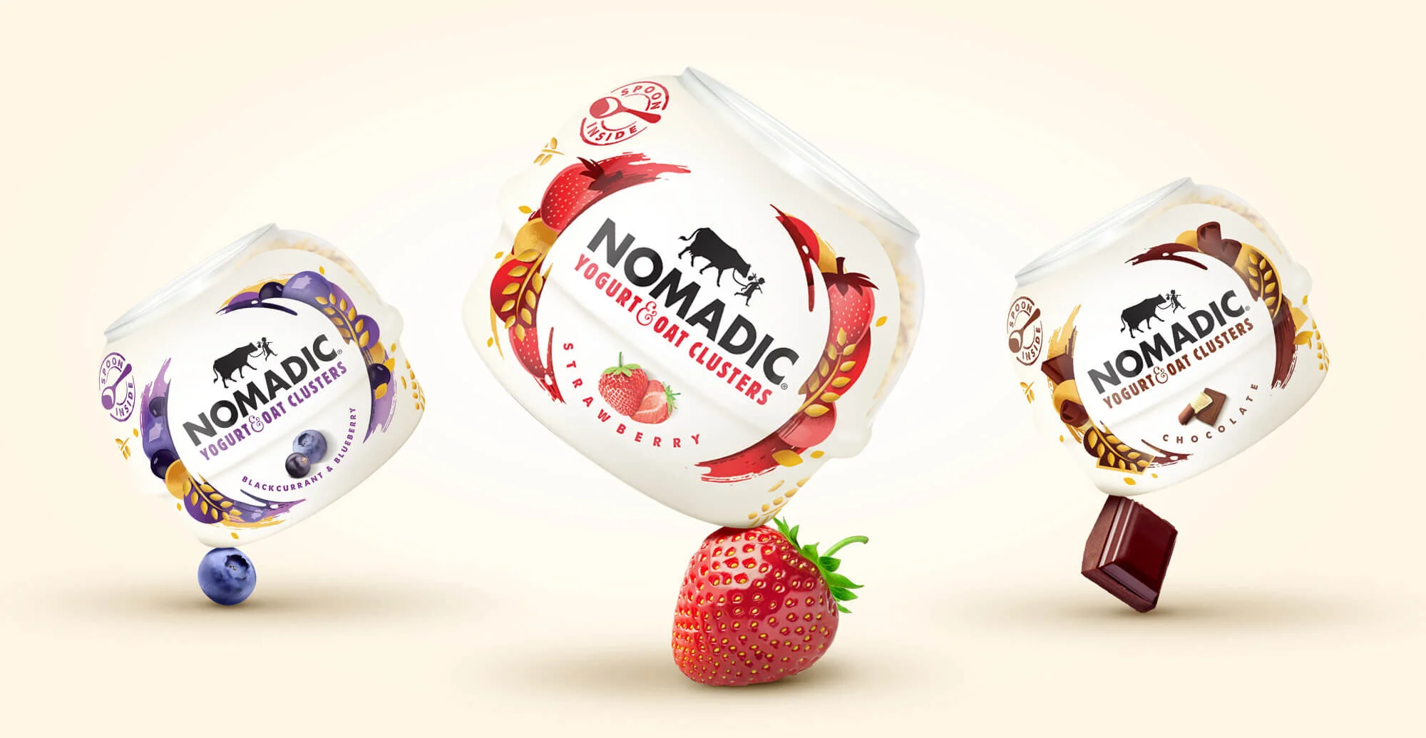
Nomadic was already an established brand within the market with a variety of kefirs, yogurt clusters and layered yogurts. However their packaging was inconsistent and had no clear brand positioning. Design happy were approached to evaluate their range portfolio, develop a creative positioning and a refresh the brand from the ground up.
Our Approach
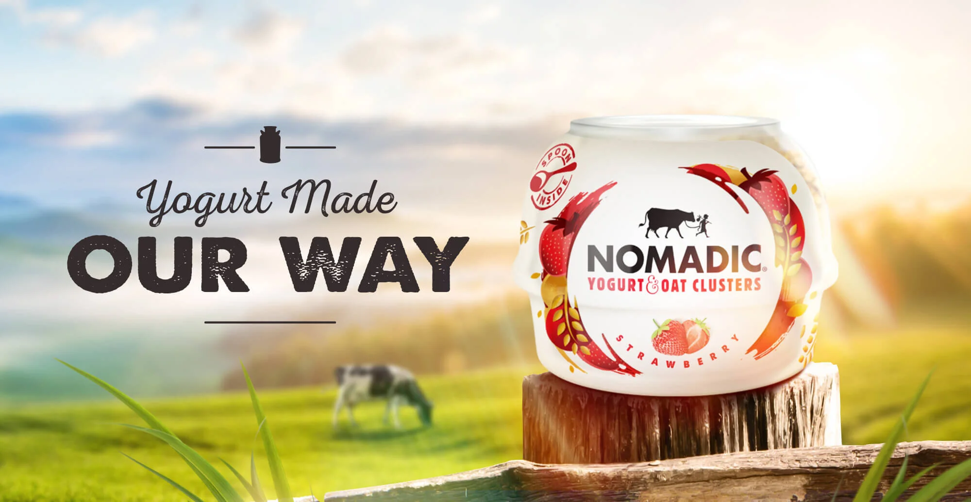
Working with Nomadic we developed a clear brand positioning… Calm from the chaos. From this foundation we develop a modular architectural system that could flex and constantly evolve across multiple touch-points. A clean central swirl brought the branding to the heart of everything Nomadic why the outer chaos allowed us to dial up key attributes whether that was flavour, provenance or brand story. This consistent branding approach created strong on-shelf standout and brand clarity.